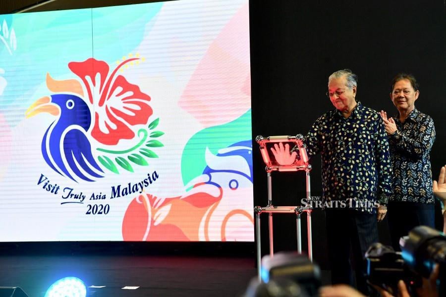
A Penang-based graphic designer said the new Visit Truly Asia Malaysia 2020 (VM2020) tourism campaign logo, which was unveiled by the Prime Minister Tun Dr Mahathir Mohamad on July 22, truly reflected what the nation was all about. (BERNAMA)
A Penang-based graphic designer said the new Visit Truly Asia Malaysia 2020 (VM2020) tourism campaign logo, which was unveiled by the Prime Minister Tun Dr Mahathir Mohamad on July 22, truly reflected what the nation was all about.
The VM2020 logo was designed by 23-year-old graphic designer Alfred Phua Hong Fook, who had beaten over 500 other entries in a competition held between March 11 and March 24 after the Ministry of Tourism, Arts and Culture decided to scrap the previous version.
Danz Chee, who has 15 years of logo design experience under his belt, said the official VM2020 logo has brought out strong “Malaysia” vibes with its simplistic Batik-style design, the fitting colour scheme of “Jalur Gemilang”, as well as the usage of iconic national trademarks, which are the rhinoceros hornbill, the red hibiscus and the wild fern known as “paku pakis”.
“I’ve checked out other entries from the contest, some of which are pretty well done, but I personally find the winning logo really screamed out what Malaysia is really all about,” Chee told Bernama.
Not long after the unveiling of the VM2020 logo, allegations of plagiarism through other logo designs began to brew up in social media platforms.
A different version of the VM2020 logo went viral on social media, alleging that the graphic designer had plagiarised from another hornbill design associated from a stock image, but the allegation was later dismissed by Minister Datuk Mohamaddin Ketapi.
This, however, did not stop netizens’ accusations of strong resemblance to a combination of multiple stock images, they believed were applied in the official VM2020 logo.
Chee explained that professional graphic designers normally do not trace stock images completely but rather use them, as well as other relevant logos and photos for designing references to develop a firm grasp of its design concepts and ideas.
He also said that graphic designers also look up these references to prevent any possible conflicts or clashes of resemblance.
“Say for instance, a client would want a tiger as their logo, and of course, we would have to look up real photos of a tiger as references and develop the important aspects of a tiger, such as its fur patterns. We would then modify them to our own desired art style, but still retain its resemblance as a tiger. You do not want to end up with a design of a cat when your client expects a a tiger,” he said.
He added that the modern trend of minimalism art style also played a huge role in the preference of the logo design, given the examples of known companies such as Adidas and Pepsi shifting their complex logo design to a more simplistic form over time. -- Bernama




No comments:
Post a Comment